R中的分类气泡图
Categorical bubble plot in R
散点图是基于笛卡尔坐标系前提下相互关联的两个数值变量的图形表示,其中一个点或点绘制在从 X 值延伸的假想垂直线和水平线的交点处和 Y 轴。其中一个变量沿 X 轴表示,X 轴通常是水平轴,另一个变量沿垂直方向表示,通常是 Y 轴。散点图的增强是气泡图,其中散点图的传统点或点被圆圈或气泡代替。这允许同时表示另一个数值变量,其值对应于气泡的大小进行映射。因此,气泡图允许我们在同一个图中映射三个数值变量。
气泡图的进一步扩展或增强是分类气泡图,除了已经在气泡图中映射的三个数值变量之外,我们还可以表示分类变量。分类气泡图的工作机制是气泡的位置由沿 X 轴和 Y 轴映射的两个数值变量的值决定。气泡的大小由第三个数值变量的值决定。除此之外,气泡的颜色还指定了它所属的类别,这就是分类变量在同一图中的表示方式。在本文中,我们将探讨两种在 R 中绘制气泡图的方法。这些方法如下所述:
- 使用 ggplot2 库
- 使用 plotly 库
方法一:使用GGPLOT2
在这种方法中,我们使用 ggplot2() 库,它是一个非常全面的库,用于渲染所有类型的图表和图形。在这种方法下,我们在 aes() 函数中添加了两个附加参数,名称为“size”,其值为数值变量,“color”用于表示分类变量。使用 ggplot 进行气泡图所需的语法和参数如下所述。
语法:ggplot(dataframe的名称,aes(x = 第一个数字列的列名,y = 第二个数字变量的列名,size = 指定大小的变量的列名,color = 的列名分类变量))
要指定气泡的大小范围,我们使用:
scale_size(range = 气泡大小的范围,name = 显示在大小图例顶部的名称)
方法
- 创建数据集
- 导入模块
- 绘制dataframe
- 显示图
程序:
R实现
# creating data set columns

height <- abs(rnorm(25, 175, 10))

  weight <- abs(rnorm(25, 72, 10))

  population <- floor(abs(rnorm(25, 1500, 500)))

  cities <- c(rep("Delhi", 7), rep("Mumbai", 6),

            rep("Chennai", 6), rep("Bengaluru", 6))

  # creating the dataframe from the above columns

dataframe <- data.frame(height, weight,

                        population, cities)

  # importing the ggplot2 library

library(ggplot2)

  # calling the ggplot function
# the value of the first parameter is the
# name of the dataframe
# the size of the bubbles is proportional to
# the population
# each of the 4 cities is identified by separate
# colors

ggplot(dataframe, aes(x = weight, y = height,

                      size = population,

                      color = cities))+

  # specifying the transparence of the bubbles
# where value closer to 1 is fully opaque and
# value closer to 0 is completely transparent

geom_point(alpha = 0.7)+

  # setting the scale of sizes of the bubbles using
# range parameter where the smallest size is 0.1
# and the largest one is 10
# name of the size legend is Population

scale_size(range = c(0.1, 10), name = "Population")+

  # specifying the title for the plot

ggtitle("Height and Weight Data of 4 Cities")+

  # code to center the title which is left aligned
# by default

theme(plot.title = element_text(hjust = 0.5))
输出:
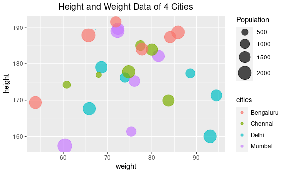
使用 ggplot 绘制分类气泡图
方法2:使用Plotly
Plotly 是一个 R 包/库,用于设计和渲染交互式图形。它建立在开源 Javascript 库之上,用于生成可供发布的图形和图表。如果您的 R 环境中不包含 plotly。
使用plotly渲染分类气泡图所需的语法和参数如下:
语法:
我们使用 plot_ly() 函数来使用 plotly 生成绘图。
参数:
- 数据集(此处为dataframe)
- x = ~要在 X 轴上显示的变量的列名
- y = ~要在 Y 轴上显示的变量的列名
- text = ~当光标悬停在气泡上方时要显示的列的名称
- color = ~ 分配颜色所依据的列名(分类变量)
- size = ~列名来确定气泡的大小
- sizes = c() 指定气泡大小的范围
- marker = list() 指定不透明度以及直径的测量单位
- 我们也可以使用 layout() 函数指定包含标题、网格结构等的布局。
方法
- 创建dataframe
- 导入模块
- 创建情节
- 显示图
程序:
R实现
# create data set column

height <- abs(rnorm(25, 175, 10))

  weight <- abs(rnorm(25, 72, 10))

  population <- floor(abs(rnorm(25, 1500, 500)))

  cities <- c(rep("Delhi", 7), rep("Mumbai", 6),

            rep("Chennai", 6), rep("Bengaluru", 6))

  # creating the dataframe

dataframe <- data.frame(height, weight,

                        population, cities)

  # calling the plotly library

library(plotly)

  # declaring the bubbleplot variable
# to render the plot
# the first parameter is the dataframe
# x and y have the column name values of the
# corresponding variables to plotted on the axes
# size holds the column name value to determine the
# size of the bubbles
# color holds the value of the categorical cities
# variable
# sizes specify the range of sizes from 10 to 50
# marker parameter specifies the opacity and the
# sizemode

bubbleplot <- plot_ly(dataframe, x = ~weight, y = ~height,

                      text = ~cities, size = ~population,

                      color = ~cities, sizes = c(10, 50),

                      marker =

                      list(opacity = 0.7,

                           sizemode = "diameter"))

  # code to generate the layout
# specifying the title
# the grids are displayed

bubbleplot <- bubbleplot%>%layout
(title = "Height and Weight Data of 4 Cities",

 xaxis = list(showgrid = TRUE),

 yaxis = list(showgrid = TRUE))

  # calling the bubbleplot variable to render
# the plot

bubbleplot
输出:
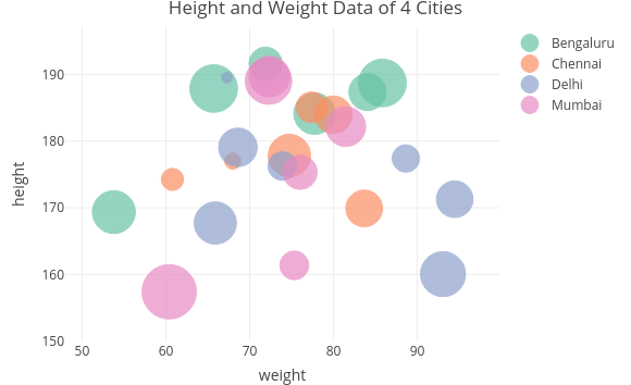
使用 Plotly 生成的分类气泡图
注:本文由VeryToolz翻译自 Categorical bubble plot in R ,非经特殊声明,文中代码和图片版权归原作者ag01harshit所有,本译文的传播和使用请遵循“署名-相同方式共享 4.0 国际 (CC BY-SA 4.0)”协议。