Tableau如何实现平滑的折线图
如果点的数量是固定的,可以直接用趋势线,选择多项式拟合,项数为点的数量减一。
如果会python可以考虑以下方案:
First of all, DON'T DO THAT!
Why? Read Andy's post: When you use a smoothed line chart, your data is not affected, it’s misrepresented!
Try to rethink and negotiate requirements, clearly understand the pros & cons of such approach!
The task:
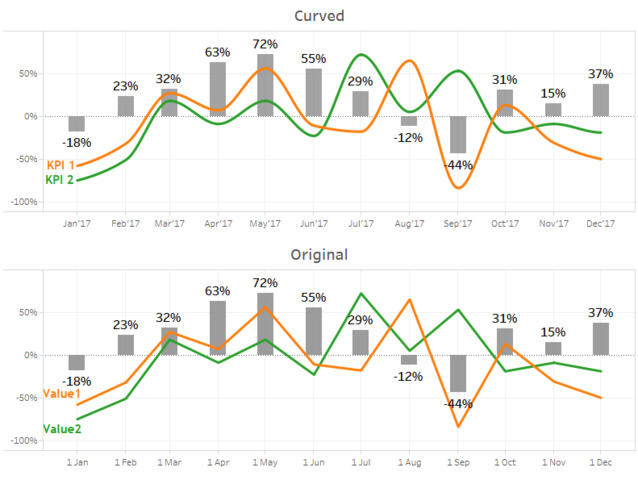
Let's say you have some KPIs that you would like to see on a timeline
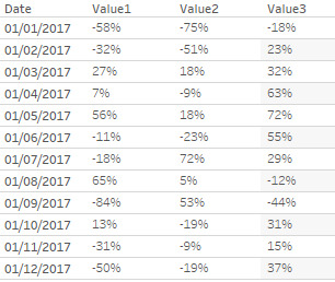
If that's a monthly report, your data set could look like this:
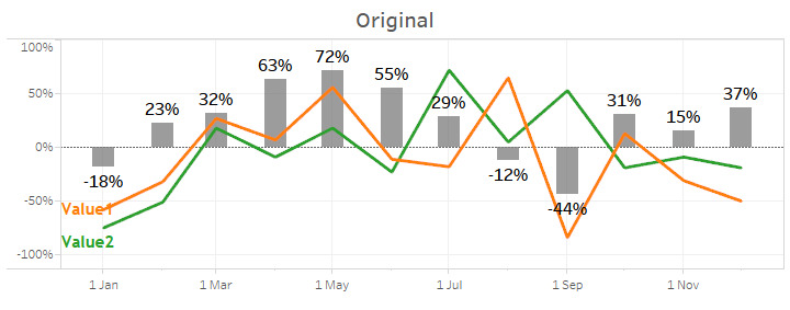
Based on this data you would like to create a nice looking chart, like following:
No? you need a smooth line? Please tell me why in the comments!
Using Tableau convenient features you can't achieve a smooth line (which is mathematically incorrect, but who cares )
To create a chart with curved line you need to generate a new data set with a higher density - that's it!
Densification in Tableau can be done in two ways:
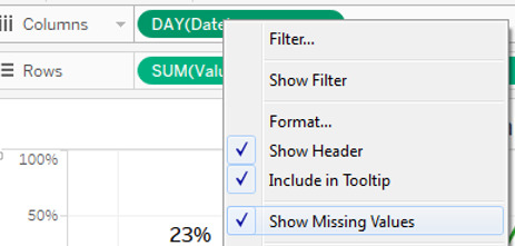
- If you have a dimension with missing values (like in above data set days are missing) just click 'Show Missing Values' on date dimension - this will create Nulls for all missing dates
- In case there are no missing values, its possible to add them by creating a Bin based on measure you're going to use as X axis and then click 'Show Missing Values'
Generation of Y axis based on densified X axis is just a simple interpolation (for Python you can see info here: https://docs.scipy.org/doc/scipy/reference/tutorial/interpolate.html)
Let's go step by step:
0. Install and connect to TabPy server, instructions and zip available here: GitHub - tableau/TabPy: Execute Python code on the fly and display results in Tableau visualizations
To connect use: Tableau: Help > Settings and Performance > Manage External Service Connection
1. Connect to data and put Date dimension on Columns (you should use continuous value of the Day level)
2. Right click on Date dimension and select 'Show Missing Values'
3. Create calculation field with Python script as follows:
SCRIPT_REAL('
import scipy.interpolate as interpolate
X_all=_arg1 #assigning date dimension to x axis
y_all=_arg2 #assigning our KPI measure to y axis
y=[i for i in y_all if i is not None] #getting rid from Nones for y
X=[i[0] for i in enumerate(X_all) if i[1] is not None] #getting list of indexes for X without Nones
Xsmooth=list(range(0,len(X_all))) #generation full list of indexes for X
ysmooth=interpolate.pchip_interpolate(X,y,Xsmooth) #interpolation (here i used pchip, but depending on source data, other function can be used, like spline)
result=[round(i,10) for i in ysmooth] #rounding to fit in output JSON
return result
', attr([Date]),ATTR([Value1]))
4. Put Calculation with Python script on Rows
Use the attached workbook to see how it works (Install TabPy first)
Workbook, data set and script are available as well here: GitHub - KRLY05/Tableau: TabPy scripts
P.S. This approach can be used for much more valuable things than just a smooth line, so follow these links to get more inspirations: